Brand, revitalization and sport: From Brother Elephants to England cricket
-
- David Green
- Communications Strategist
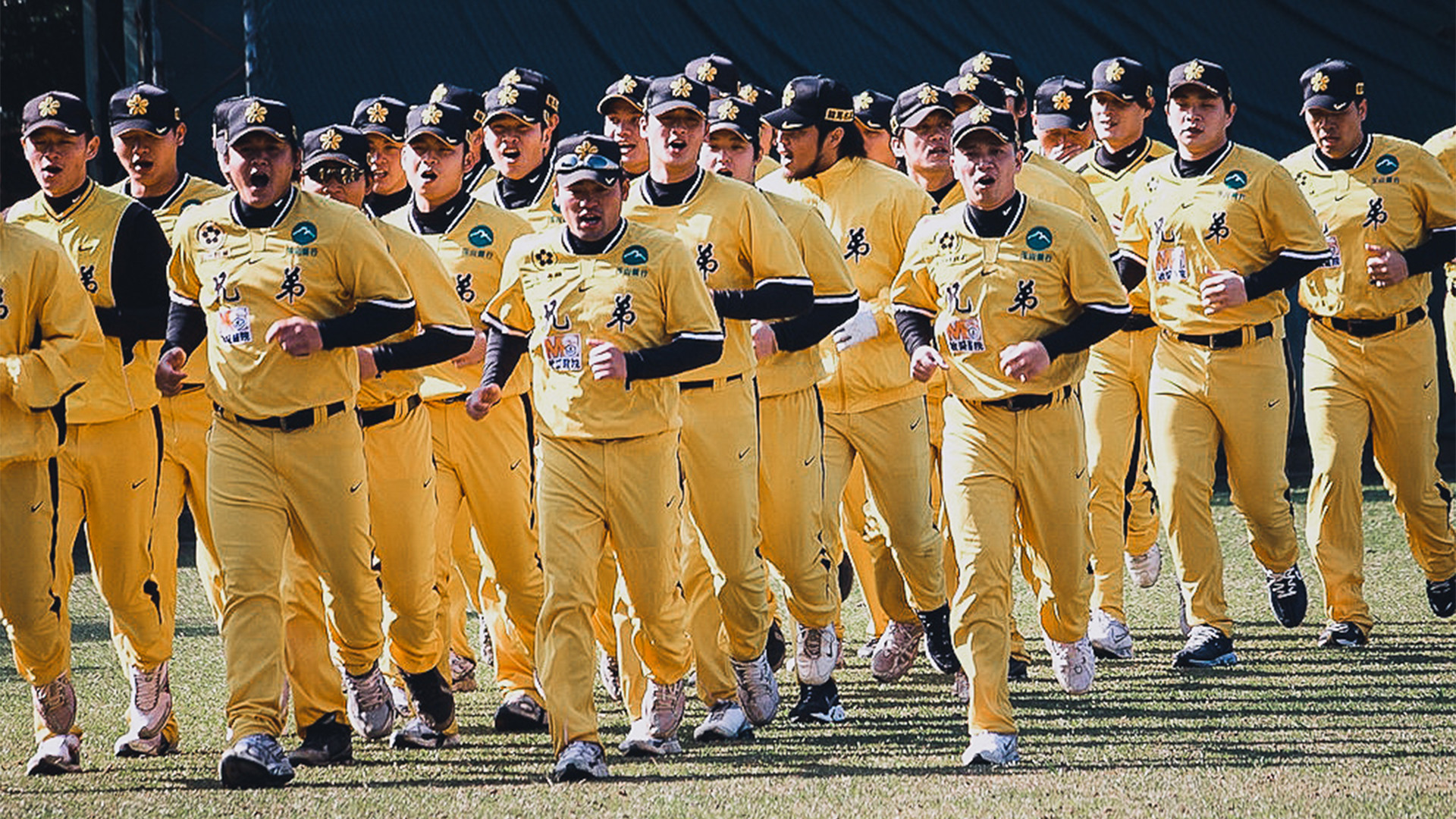
This spring, Taipei’s Brother Elephants baseball team overhauled its visual identity, maintaining its striking yellow uniforms, but significantly changing its logo and typography. The shift was broadly welcomed by fans, who praised the evolution from the team’s somewhat childish-looking elephant logo to a sleeker typography coupled with the image of a more aggressive and menacing-looking elephant (complete with baseball lodged in its trunk).
The revitalization of its visual identity underscored a shift in ownership after Hua Yi acquired the team, and CTBC Financial Holding became its sponsor, in December 2013. It is not clear if the rebranding was undertaken merely in the hope of driving higher merchandizing revenues, or was intended as part of a deeper rebranding process that goes to the heart of the way the team plays the game.
Changing superficial identity does not always mean a change in results
Either way, the overhaul of its outward identity has yet to have a material effect on the most important arbiter in sport: results. The Brother Elephants currently sit at the bottom of Taiwan’s Chinese Professional Baseball League, unable to recapture the glorious multi-championship-winning days of the mid-2000s.
Perhaps this should not be a surprise. After all, it is essentially the same team that stepped onto the park before and after the new, more aggressive identity was implemented. The fact the team now sports a more aggressive and powerful looking typography and logo does not necessarily mean they will adopt a similarly more aggressive, powerful and consequently successful style of play. It might seem obvious, but implementing a superficial change without a corresponding change in ethos, personnel or philosophy will have little or no impact on the team’s performance.
Sport clearly demonstrates a distinction between brand as surface implementation of a visual identity or communications strategy, as opposed to the force that shapes the raison d’être or driving force behind a company or team.
England’s cricket team have implemented a root-and-branch rebrand…
England’s one-day cricket team offer a converse example. The team was humiliated at the recent World Cup in Australia and New Zealand – comprehensively outgunned by more aggressive opponents, including the minnows Bangladesh. The result was a return to home soil with heads hung in shame and souls spreadeagled for searching.
Yet at the start of this summer, it became clear to fans and media that the team had looked deep inside itself and emerged determined to pursue a new direction. It had undergone a fundamental, root-and-branch rebrand process. Previously, the thinking had been that the team must have at least a few “classical” batsmen – those that play the game properly, score at a steady rate, and most importantly don’t get out playing silly shots. It was a conservative brand of cricket, and one that was shown to be stranded in the past when contrasted with massive-hitting, ultra-aggressive opponents like Australia and Sri Lanka.
Now, under a new manager, the England team has clearly been given the go-ahead to express themselves on the pitch, to play their natural game, and above all, to hit the ball as far and as hard as possible. These are much the same players that died such horrible sporting deaths just a few months ago, but they are playing in a very different way.
…With massively successful results
The result has been the revitalization of the side. Not just in terms of results – having secured a win over World Cup finalists New Zealand – but also in terms of spirit and the support it is receiving from the fans. Nobody wanted to support the old, conservative England, but this new team, playing a more aggressive brand of cricket, is made of entirely sterner and more exciting stuff.
The England team found this style of cricket without changing their uniform, colors, logo or equipment. It is clear that the change in the brand of their cricket, that deeper revolution in their thinking, has been responsible for a much deeper, more effectual change than a revamp of the team’s visual identity ever could.
This is not to say that visual identity is not important – it clearly is (especially when it comes to replica kit sales), more that this opposition serves to crystalize an important distinction that is too often misunderstood or overlooked by companies in Greater China that are seeking to rebrand: a rebrand without a corresponding change in or reinvigoration of a brand’s essence represents a missed opportunity; one that may not have any impact on the company’s performance or success.


